Dear CULC 2010 poster presenters,
For our poster session, we
will be using the same guidelines used at the LSA Annual Meetings, written below. Also,
please provide a handout. You can download the guidelines at the very bottom of the page.
How to Design and Present a Successful Poster
By Kristen Syrett
1. Creating a File
Posters can be created using different methods. Some people like to prepare individual sheets of paper using a program like Microsoft Word or WordPerfect. If you do this, you may choose to display the paper without backing or with some kind of colorful backing. If you use colorful backing, choose one solid color for the entire poster or different colors for each of the main sections (see "Headings"). Avoid using too many colors. Another way to design your poster is by using PowerPoint.Customize the dimensions in Page Setup. You can choose to display the grid on the screen to help you with layout. In either Word or PowerPoint, you will want to make sure you plan your dimensions and layout accordingly.
Many copy shops can print posters, but check on dimension limits for lamination. There are also a number of online companies. You can send a PowerPoint of a pdf file to them by e-mail; they will print the poster and ship it to you. Many companies can do this within a day or two. You will want to purchase a poster tube. These are available from many online companies and from art stores.
2. Physical Guidelines
A. Dimensions
The poster boards used at LSA meetings are 8' wide x 4' high. Take care not to exceed the
dimensions. Having a poster that curves around the edges of the display area not only detracts from your poster but means you may impinge on the presentation area assigned to someone else.
B. Paper and Lamination
You may choose either a glossy or matte finish. You may also choose to laminate your poster. However, be aware of two things. First, with glossy paper or lamination, you run the risk of a glare from light. Of course, the amount of glare varies with the lighting in the location where you are assigned to present your poster. This is generally not a problem, but it is something to consider. Second, laminating is good in that it water-proofs the poster. Many people display their posters in their home institutions after they are done presenting at the conference, so it is nice to make sure your poster will last throughout the conference and afterwards (not to mention during the travel to and from the conference). If you choose not to laminate your poster, consider protecting it with sprays like those put out by Krylon (available in hardware and art stores). Frequently used by artists to protect their work and prevent smudging, these sprays are inexpensive and easy to apply (NOTE: Do not use such sprays in your hotel room; they need to be applied in a well-ventilated area).
C. Mounting Your Poster
Mount the poster using push pins, tape, or binder clips. If you use push pins, you might want to coordinate the color of the pins with the colors of the poster (using only one color at a time) or use clear push pins. The holes left by push pins are not very noticeable. Tape is usually not a good option, since it might not support the weight of the poster, looks tacky, and might permanently damage the poster. The poster boards may be too wide for binder clips. However, if you use binder clips, place a tissue or cotton between the clip and the poster so that a dent is not left. See the "Handouts" section for notes on displaying handouts. Even though you are scheduled to present your poster during certain times, you can and should leave your poster up as long as possible on your presentation day. At LSA meetings, you are asked to mount your poster early in the morning on the day of the poster session. Put up your poster as soon as possible; people passing through the area will be able to view your poster, and you can see other presentations before presenting yours later. Leave your poster up after you present but take it down by the deadline.
3. Design
A. Color and Background
Avoid the use of especially bright colors or too many colors. Two or three colors are usually
enough. If you need to use color in the figures or illustrations, coordinate these colors with the main colors. Avoid bitmap pattern backgrounds, since they lose their clarity when printed on a poster.
B. Text and Fonts
Minimize the amount of text in the poster. The more text you have, the more difficult it is for people to make it through the poster. More text also means you might spend more time reading text in your presentation instead of presenting your work. Avoid sentences and use bullet points when possible. Do not include your abstract (it is in the Annual Meeting Handbook already). Consider including a sentence under each graph as a caption summarizing the results presented. Use active, not passive, voice. Be consistent with justification and align blocks of text. Choose a font (or fonts) that is easy to read and which can be read by other computers, if you are sending your file off to be printed into a poster. Some companies recommend that if you use non-standard text, that you convert the text to curves (as in Corel) or save the file with the TrueType fonts embedded (as in PowerPoint). Minimize the number of fonts used (e.g., do not use one font for headings, another for the text, another for the title, yet another for graph labels, and so on). It is often recommended that headings be in a sans serif font (like Arial or Helvetica), and text in a serif font (like Times New Roman or Times). However, you can use either throughout. Avoid variation in text format. Only use bold when it is absolutely necessary or especially helpful. Avoid italics. Choose the text color in accordance with the background color. The title should be legible from at least 20 feet away. The headings and text should be legible to someone standing 5-6 feet away. This means selecting the following (general) font sizes:
Title (first line(s)): 80-120 (bold, can be all-caps, but not name(s) of author(s))
Title (affiliation, contact info): 60-80 (bold)
Headings: 50-70 (bold, can be all-caps)
Text: 24-36 (certainly no smaller than 16)
Acknowledgements: 18-28
References: 18-28
The poster session number, if assigned, should be printed at the top of the title banner to one corner, in 90-100 point font. These are only recommendations, and the size will, of course, vary depending on the font chosen. Control the font sizes in the graphs.
C. Title and Headings
The poster should be easy to follow, even if you are not there to present it. The title should be clear, informative, and short (less than eight words if possible). The following headings help to organize a poster and maintain a smooth flow of information. (NOTE: The "/" here indicates a choice of headings.)
Introduction/ Background (top left)
Objectives/Research Questions (top left)
Experiment/Study 1, 2, etc.
Subjects
Method/Experiment Design
Results
Summary/Conclusions (bottom right)
Selected References (bottom right)
Acknowledgements (bottom right)
Contact Information (if not in the title area)
The size ratio of body text to headings should be about 1:2. Align the headings.
D. Spacing and Sequence
Recommended Proportions: 20-30% text, 40% graphics/visual aids, and 30-40% empty space. Design the poster in a way that it makes the message clear to your audience, does not require too much effort on the part of the audience to follow along, and leads the audience to ask you questions during the session and want to follow up with you afterwards. Avoid clutter. Include as much empty space as possible; people's eyes need a rest. Aim for at least a one-inch margin around the border of the poster and the blocks of text and graphs; this empty space frames the text. Keep the blocks of text small. Make sure the sequence is clear and logical. Some templates are available online from poster printing companies. A three- to four-column layout is helpful. Put the most important findings
towards the center and in the top right and bottom left corners. The information flow should be either vertical or horizontal, but not both.
E. Visual Aids
Use visual aids, such as graphs, figures, and diagrams, whenever possible to demonstrate the main points. Use text only for support--for example, as captions. In the figures, focus on
relationships, not exact values. Eliminate non-essential elements in charts and figures (e.g., grid lines, tick marks on the axes, background colors, extra digits after the decimal, labels, 3D displays, etc.). Here are some examples to illustrate these points.
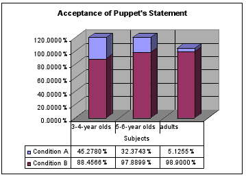
There are too many non-essential elements in this chart.
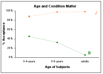
This chart is much better. The trends are clear.
It is usually not necessary to label graphs or figures as Figure 1, Table 1, etc. Charts from Excel or another program should be pasted in as Enhanced Metafiles or as pictures in jpg or tif format. Photographs and scanned images should be 100 dpi in their final size. (Some sources recommend scanning images in at least 200 dpi). Align graphics.
F. Author Information
Make sure the information about the authors is visible and can be read from a distance. This information includes your name(s), institution(s), and contact information. Including the logo for your school might be all right, but including your school mascot is not; neither is recommended.
4. Presentation
During a poster session, many posters are on display within one area. Often hors d'oeuvres or a meal is served at the same time as the poster session, in the same room. Audience members wander around browsing posters. They move from one poster to another, stop briefly, and then continue on. People are drawn to posters -where the author looks ready and willing to present the work or where a presentation is in progress, those in their area(s) of interest, and those that simply attract their attention. Remain next to the poster during the designated presentation session. There are different ways to present a poster. Some presenters like to let people take a look for a few seconds before saying anything. Others like to offer a walk-through once someone begins looking at the poster. Do what you feel comfortable with and what you think is best for the audience at hand. Avoid long conversations with individual people, especially concerning non-poster material, since this discourages other people from learning about your work and makes you seem inaccessible. Be prepared to describe your poster briefly (no longer than a few minutes). Avoid reading chunks of prose on your poster or reciting a rehearsed oral presentation. You want to have both informal and informative interactions with people about your work. Know the take-home message of the poster—the big claim you are making and why it is important. When someone asks you for a run-down, do not start by describing in detail the previous work and background information. You may want to ask the person how much s/he knows about the topic. Be prepared to explain certain elements in more or less detail, depending on peoples' questions and interest. As you are talking to one person or one group of people, other people may join the crowd. Make eye contact with them and work in a sentence or two referring to material they may have missed. At the end of your presentation, make sure people walk away with a handout.
5. Handout
If you choose to design a handout or print a mini-version of your poster, consider the option of including more information than you did in your poster. If you designed your poster using PowerPoint, follow these steps.
(1) Send the file to your printer or convert the file to a pdf file.
(2) If you are converting into pdf, print to your Acrobat Distiller (PCs), save the file as a pdf (Macs), or go through Adobe Acrobat and convert the ppt file to pdf.
(3) Print slides (not notes or handouts) that fit on the paper.
The LSA provides a chair or table next to each poster, on which you can set your stack of
handouts. You can also post a folder containing your handouts alongside or below your poster. Do not set your handouts on the ground, since either you or an audience member will need to bend down to pick up a handout (unpleasant either way). Also, do not hold your handouts the entire time; your hands will not be free, and holding the handouts will also discourage people from casually picking one up as they "browse" the posters.

|
Posters_guidelines.pdf Size : 145 Kb Type : pdf |